STARZ · Senior UX Designer · 2013–2014

A Career Pivot into
Streaming — Then
Documentation That
Outclassed HBO
and Netflix

Left a Creative Director role running marketing design to pioneer the frontier of streaming TV. Built apps across seven platforms, introduced flow state thinking to content discovery, designed navigation around movie poster artwork instead of thumbnails — and produced Chromecast documentation that Google called the best they'd ever seen.

7×
Platforms: iOS, Android, Xbox,
Roku, Fire TV, Nexus, PlayStation
3→1
Brands unified: STARZ Play,
Encore Play, MoviePlex Play
#1
Google called our Chromecast
docs best they'd seen
R&D
PLAY concept — flow state
streaming, ahead of its time
Role
Senior UX Designer
Timeline
2013–2014
Team
Led 2 junior designers
Scope
Apps, PLAY concept, Chromecast
STARZ Play Concept — homepage background art
STARZ Play — Concetp by STARZ. Full-bleed movie poster artwork as the primary UI surface. The navigation was designed around the art, not the other way around — putting the cinematography that makes STARZ content worth watching front and center on every screen.

The career pivot

Creative Director → Streaming Pioneer.
A deliberate leap.

Before STARZ, I was a Creative Director running marketing design — brand campaigns, print, digital marketing. It was comfortable, established, well-paying. And it was the wrong direction for where I wanted to go.

Streaming television in 2013 was genuinely new territory. Netflix was two years into producing original content. HBO Go was barely functional. The idea that you could design an app that delivered a cinematic experience — on a phone, on a game console, through a dongle plugged into your TV — was still being figured out in real time. No conventions. No established playbook. Pure frontier.

STARZ was the entry point. A premium cable brand trying to understand what it meant to be a direct-to-consumer streaming service, with three separate brands (STARZ Play, Encore Play, MoviePlex Play) that needed to coexist without cannibalizing each other. The design challenge was as much strategic as it was visual — and it was the beginning of a streaming career that would eventually take me to Sling TV.


The Chromecast Story

Google was skeptical. The documentation changed that.

Chromecast launched in 2013 and Google was actively courting streaming partners — but they had standards. Partners needed to produce documentation that demonstrated they understood the Chromecast interaction model: the relationship between the mobile sender app, the TV receiver experience, and the continuous session management that made casting feel seamless rather than broken.

Most partners submitted functional specs. What I produced was a comprehensive process documentation that mapped every state, every interaction, every edge case across the full Chromecast experience — sender, receiver, and the transitions between them. It wasn't just what the product would do; it was a design system for how STARZ would think about casting as a first-class experience, not a checkbox feature.

Google's response
"This is the best Chromecast documentation we've seen — better than HBO and Netflix."
Google Chromecast partner team · 2013–2014

Turned Google from a doubter to a highly invested launch partner

STARZ Chromecast — mobile sender and TV receiver
STARZ Chromecast. Mobile sender app casting to the Chromecast receiver. The documentation that mapped this experience — every state, transition, and edge case — secured STARZ as a premier Google Chromecast launch partner.

The Documentation

98 slides. 5 platforms. Every state, every edge case — built in InDesign before Figma existed.

In 2013, screen design tools weren't what they are today. Sketch was barely a year old. Figma didn't exist. What most teams were doing was exporting JPEGs from Photoshop and dropping them into PowerPoint. That wasn't going to cut it for a Google partner integration document that needed to cover five platforms, dozens of interaction states, and the precise relationship between a mobile sender app and a TV receiver — all at a level of rigor that Google's partner team could actually use to validate the integration.

The solution was a print design approach: InDesign with data merge and a CSV. A master template was built once — screen frame, state labels, flow annotations, footnotes, legal footer, version number. The CSV contained every screen's metadata: title, state description, interaction details, platform, version. Data merge auto-populated the template and exported the full document in minutes. What would have taken days of manual layout was reduced to a template build and a spreadsheet.

The output

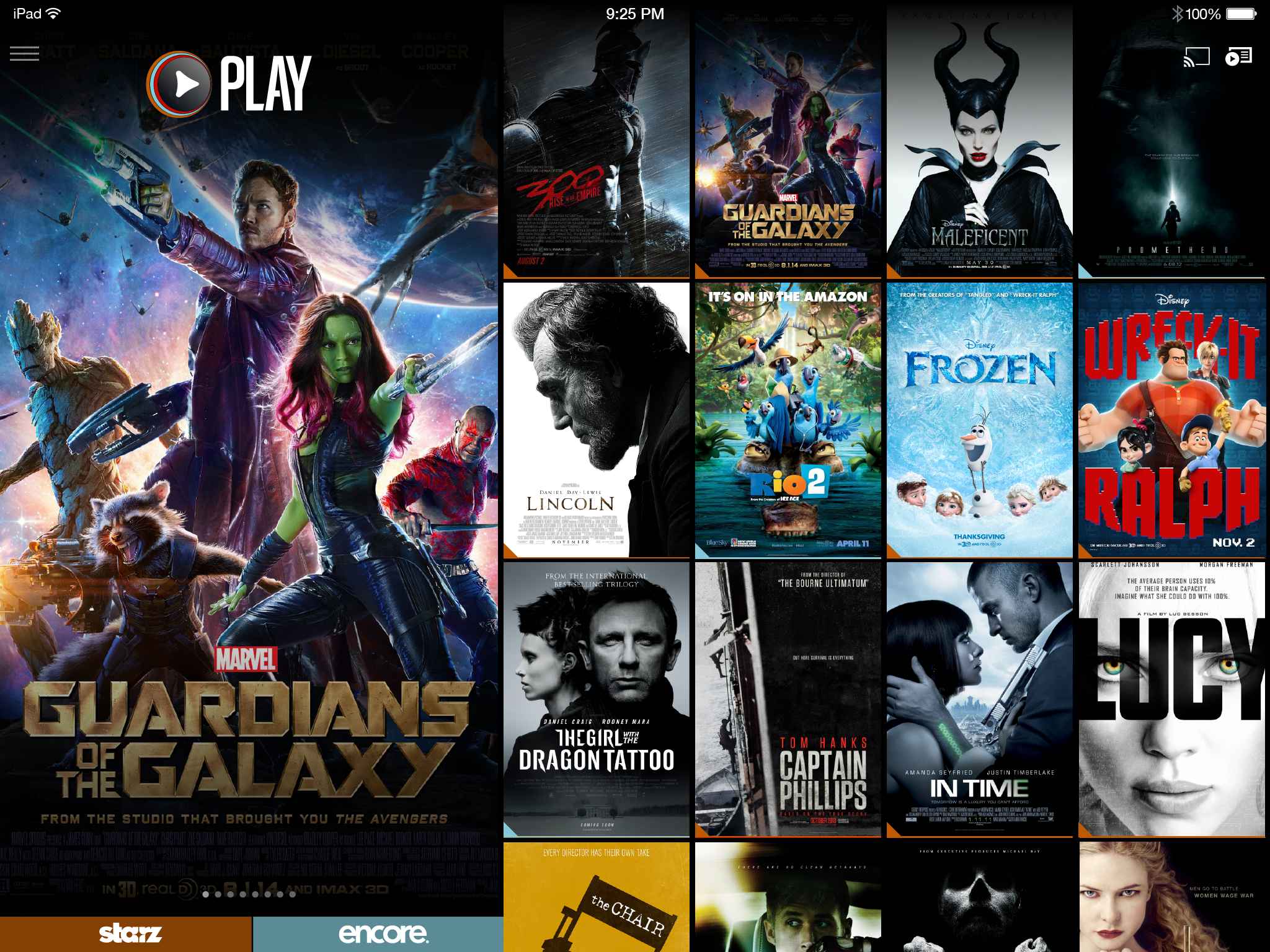
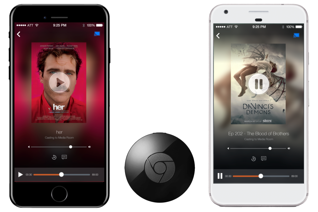
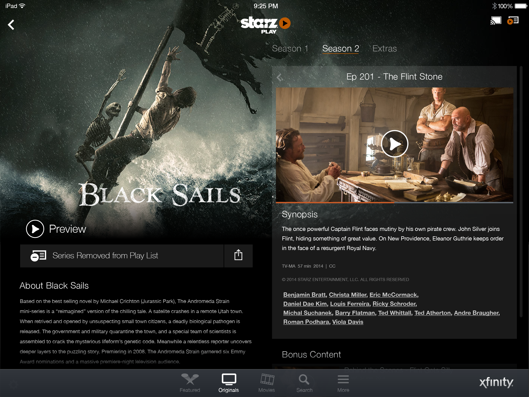
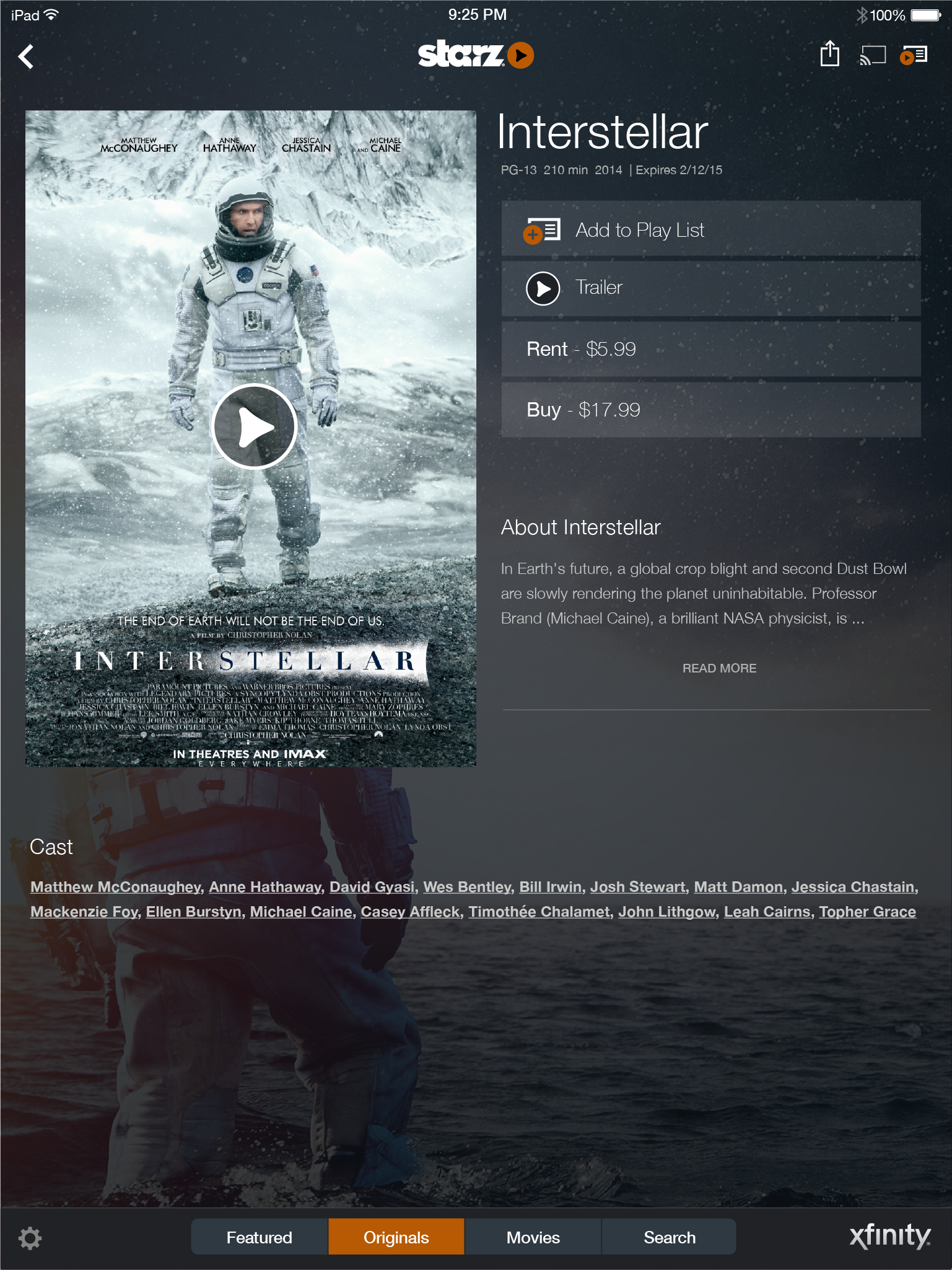
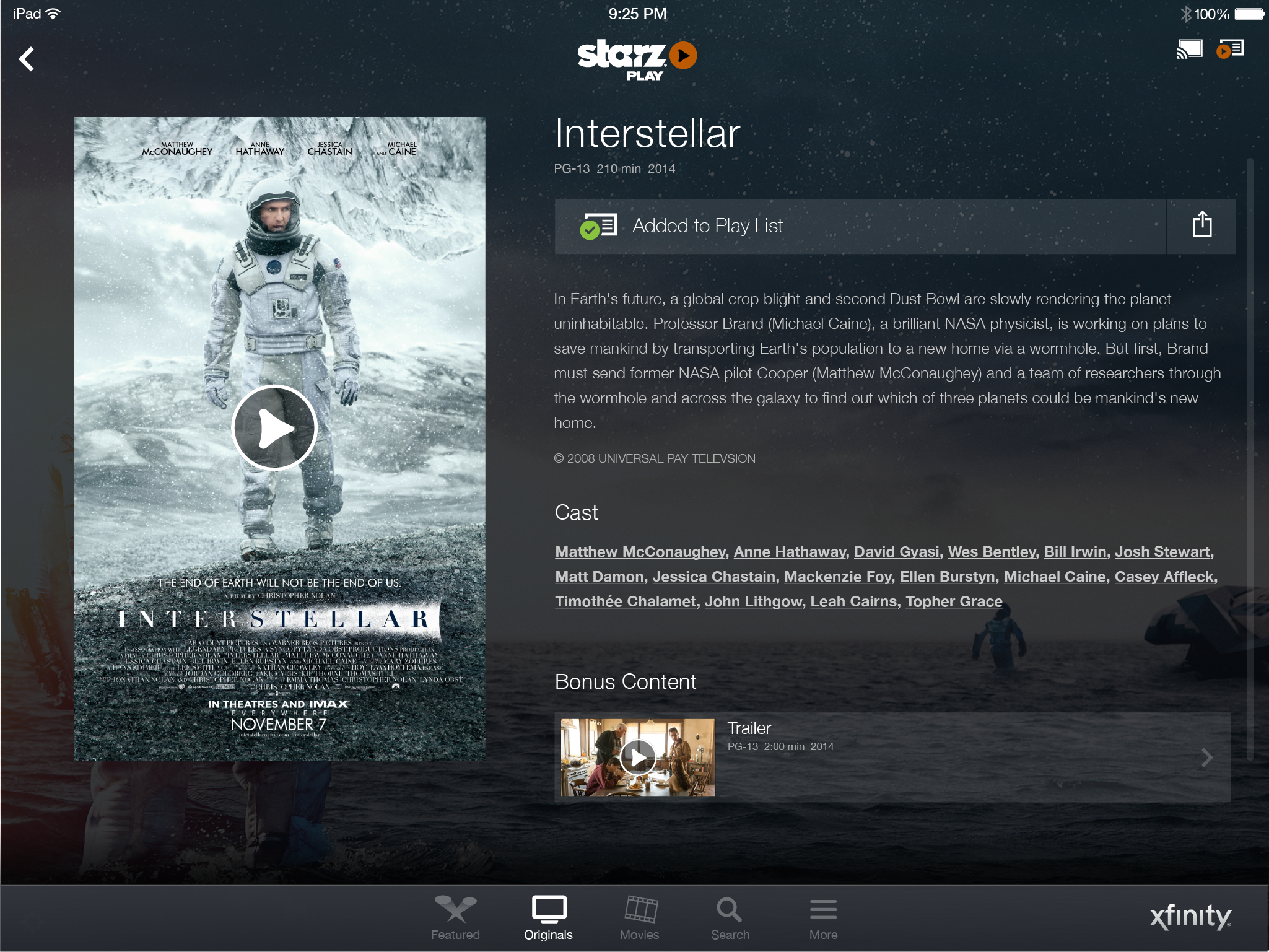
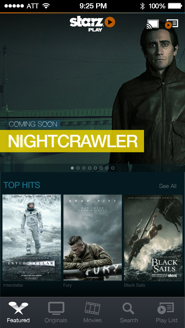
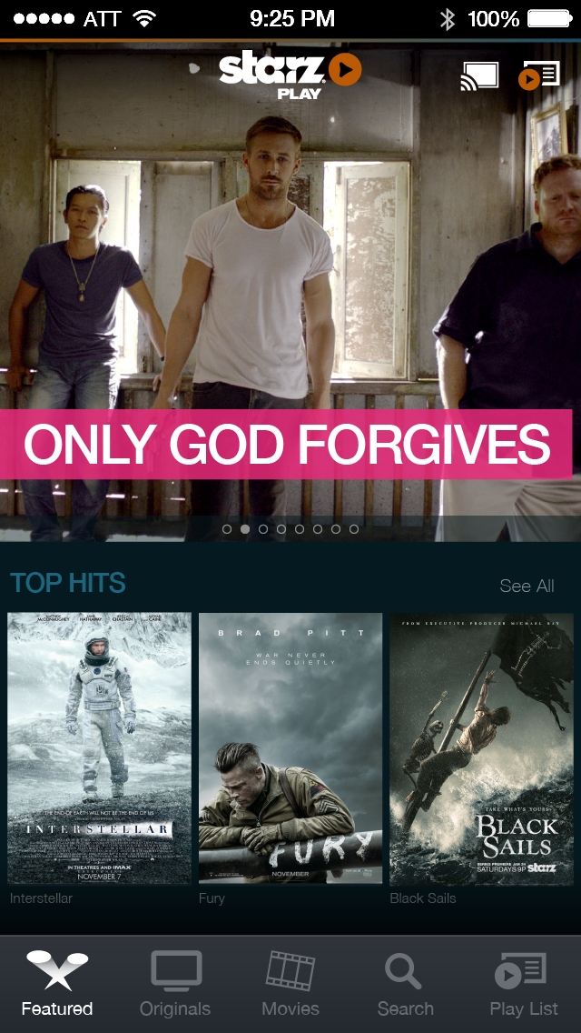
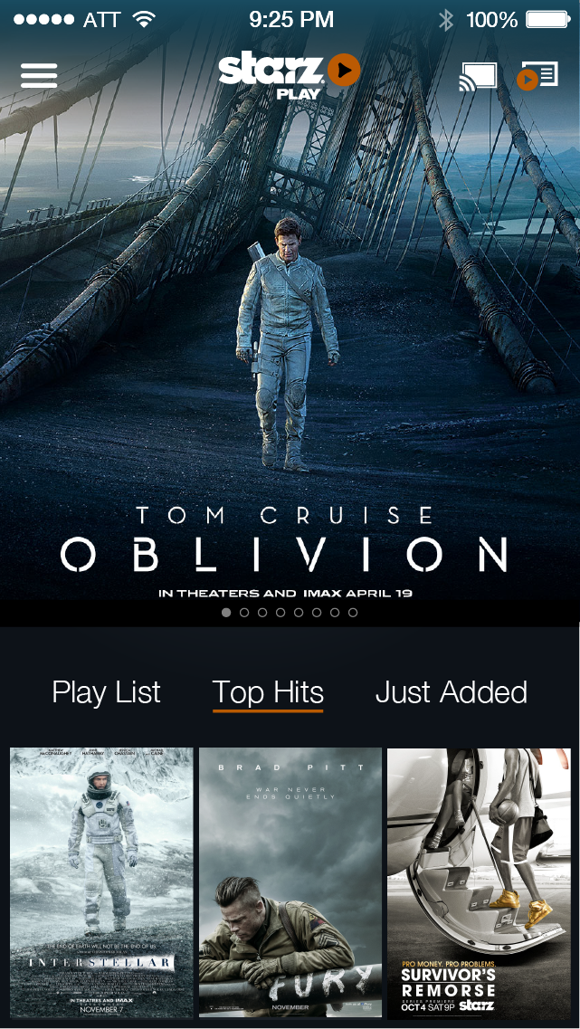
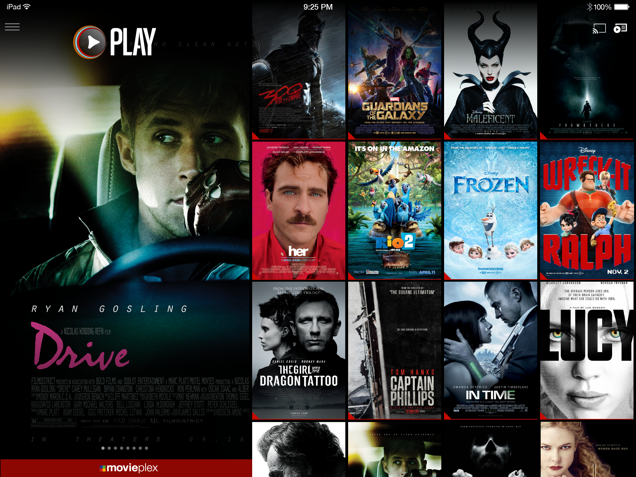
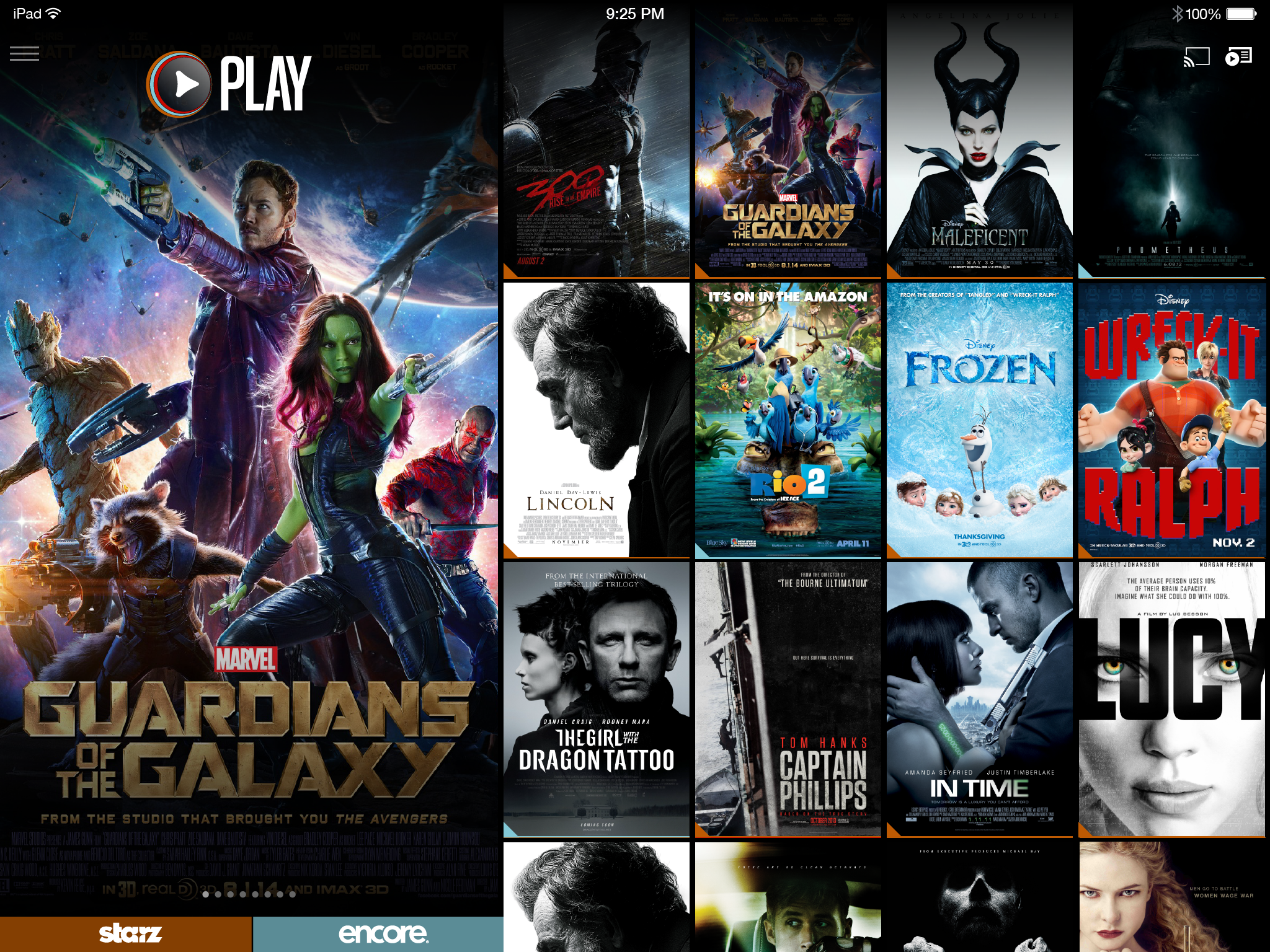
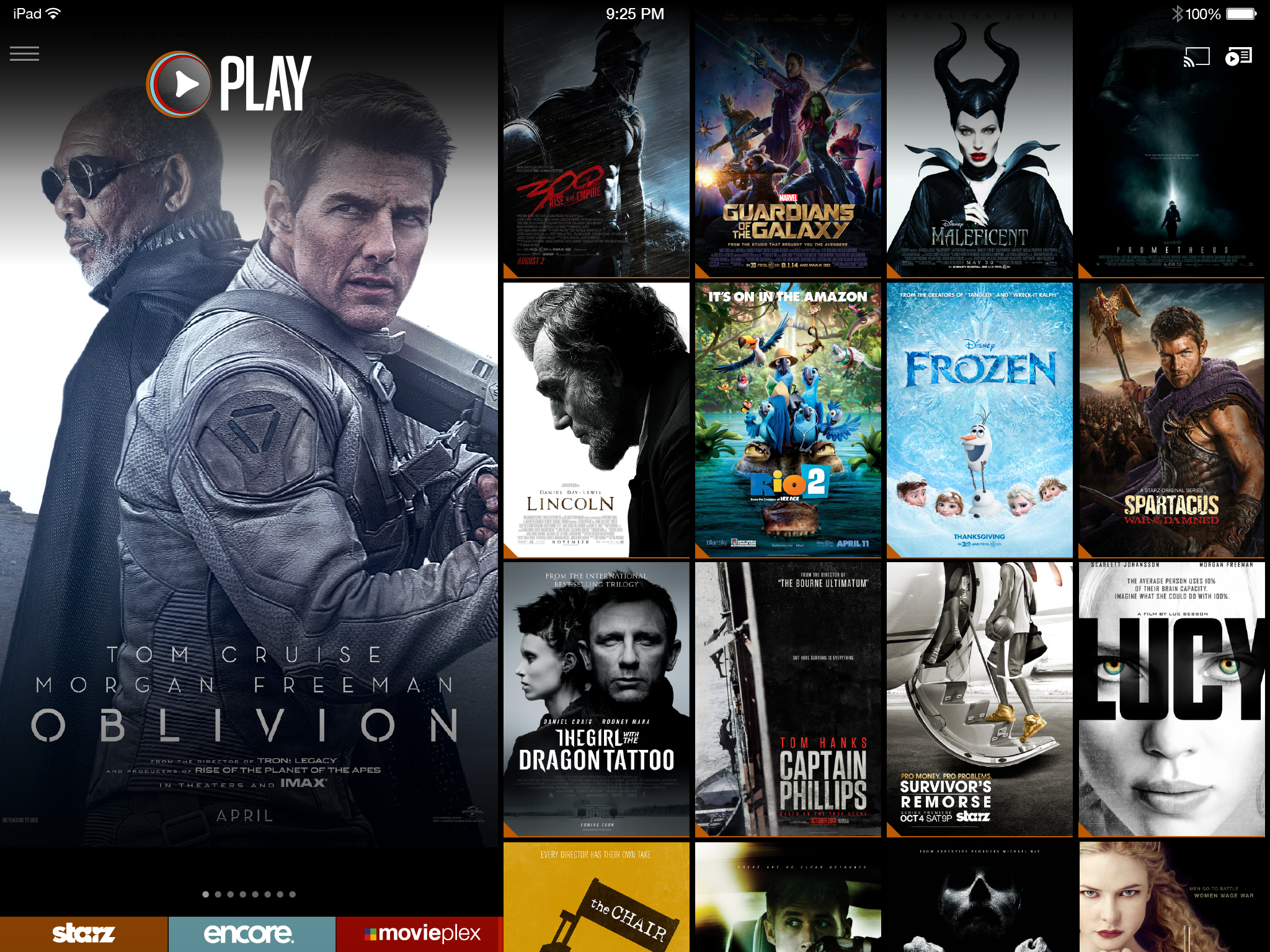
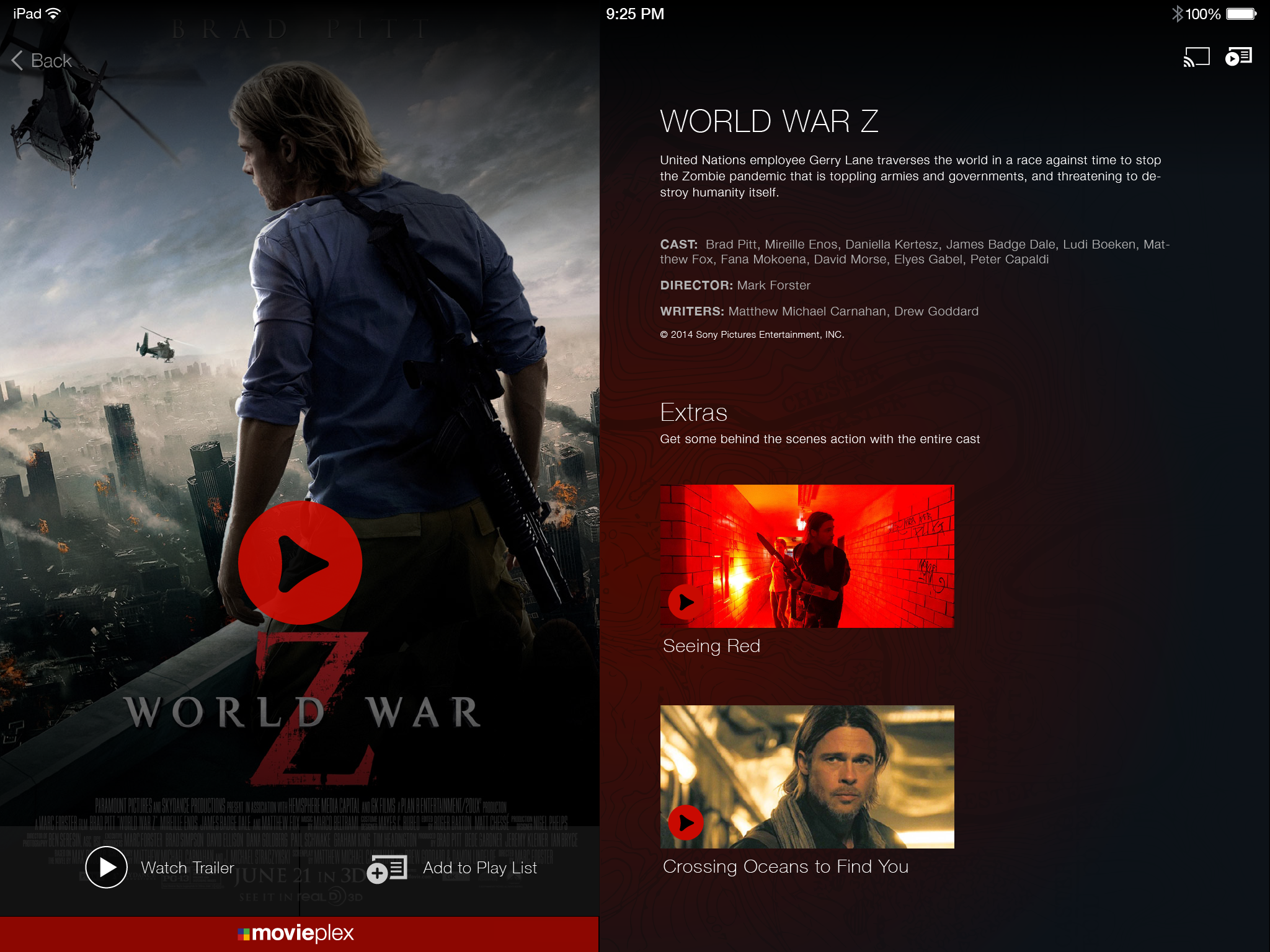
A 100-page Chromecast integration document covering iPhone, iPad, Android Mobile, Android Tablet, and Chrome browser — every sender state, every receiver state, every transition, every edge case. Flow diagrams showing the full user interaction model between sender and receiver. Screen-by-screen interaction specs with precise state descriptions. Version-controlled, legally signed, confidential. The document Google called the best they'd seen — better than HBO and Netflix.

The document covered the complete Chromecast experience lifecycle: disconnected state, cast icon discovery, device selection, connection animation (4-stage), playback buffering, in-progress controls, pause states, episodic auto-roll, idle screen management (5 min / 10 min), and the precise handoff logic between sender and receiver when users navigated away from content mid-playback. Every state that could break the experience was documented before a single line of code was written.

📱
iPhone
Full sender flow
All states
📲
iPad
Tablet sender
All states
🤖
Android Mobile
Full sender flow
All states
📋
Android Tablet
Tablet sender
All states
🌐
Chrome Browser
Web sender
All states
Every state documented
Connection Flow
Disconnected state
Cast icon discovery
Device selection
Connection animation (4-stage)
Connected state
Disconnect flow
Playback States
Buffering
In-progress controls
Paused state
Persistent mini-controls
Expanded controls
Episodic auto-roll
Edge Cases
App idle (5 min)
Default receiver (10 min)
Navigate away mid-playback
Blue notification bar
Chromecast intro (Phase 2)
Phase 2 persistent controls
Built in Adobe InDesign using data merge with a CSV — master template auto-populated 100 pages in minutes. A print design solution to a digital documentation problem, before Figma existed.

Brand Unification

Three streaming services, one unified experience — without losing any brand's identity.

STARZ operated three distinct streaming services, each with their own content rights, subscriber bases, and brand identities. The design challenge wasn't just visual — it was structural. How do you merge STARZ Play, Encore Play, and MoviePlex Play into a single app experience without violating content licensing agreements, confusing existing subscribers, or diluting three brands that had meaningfully different audiences?

The solution was a role and permissions layer that determined what content each user saw based on their subscription, while presenting a unified browsing experience that let the content — not the brand separation — drive discovery. The three brands coexisted as content filters within a single system, not as three separate apps.

STARZ Play
Premium original series, blockbuster movies, first-run content
Encore Play
Classic Hollywood films, fan favorites, curated catalog
MoviePlex Play
Independent films, foreign cinema, specialty programming

The design philosophy

Navigation built around movie poster art, not thumbnail rectangles

Every streaming service in 2013 used the same layout: small rectangular thumbnails arranged in horizontal rows. It was efficient. It was completely at odds with what made movies and television worth watching.

The thesis behind STARZ's app redesign was simple: the art is the content. Movie poster artwork — the imagery that cinematographers and art directors spent months crafting to communicate the emotional register of a film — was being reduced to a 160×90 pixel rectangle in a grid. That wasn't just aesthetically mediocre; it was strategically wrong for a premium brand whose entire value proposition was the quality of its content.

The navigation redesign put artwork first. Larger images. Full-bleed backgrounds that pulled from the content being featured. Dynamic color banners in featured sections that extracted palette from the artwork itself — so the interface became an extension of the content rather than a container for it. The browsing experience started to feel less like a catalog and more like a cinema lobby.

Tablet & Mobile App — STARZ Play

Immersive, content-driven design for a cinematic experience on every screen.

The tablet experience applied the artwork-first principle to touch navigation. Larger, high-quality images dominated the interface. Background imagery was integrated to create immersion — drawing users into the world of each show or movie before they pressed play. The playlist management system let users curate their own viewing queue, with add/remove interactions designed to feel as natural as the content itself.

STARZ Play iPad — playlist
iPad — Playlist. User-curated content queue. Full-bleed artwork, content-forward layout.
STARZ Play iPad — title detail episode
iPad — Series detail. Episode browser with artwork-led layout and series context.
Movie detail — add to playlist
Add to playlist. Movie detail with playlist action.
Movie detail — added to playlist confirmation
Added confirmation. Inline confirmation state — no modal, no interruption.
Title detail — unauthenticated
Unauthenticated state. Clear upgrade path without interrupting the browse experience.

iPhone App

The full cinematic experience compressed to a 4-inch screen.

The iPhone app maintained the artwork-first philosophy in a significantly more constrained canvas. The home screen explored multiple layout variations — prioritizing featured content at the top with smart use of dynamic color to keep the experience feeling cinematic rather than utilitarian. Title detail screens on mobile carried the same full-bleed art treatment as tablet, with playlist management interactions optimized for one-handed use.

iPhone home v1 iteration 87
Home v1.87
iPhone home v1 iteration 88
Home v1.88
iPhone home v2
Home v2
iPhone featured playlist grid
Featured grid
iPhone title detail add to playlist
Title detail
iPhone app — multiple home iterations. v1.87, v1.88, v2 home variants show the iterative design process toward the final artwork-first layout. Version numbers visible in the filenames reflect a rigorous iteration discipline at the screen level.

PLAY — R&D Concept

Flow state streaming: an algorithm-driven, artwork-first unified platform, before that was a thing.

PLAY was a forward-looking R&D concept — a vision for what STARZ could become if it fully committed to the principle that content discovery should feel like immersion rather than browsing. The concept merged STARZ Play, Encore Play, and MoviePlex Play into a single content experience, with an algorithm that adapted to viewing behavior to deliver a continuous flow of relevant content.

The "flow state" framing came from psychology — the cognitive state where challenge and skill are perfectly matched and time disappears. Applied to streaming: the moment when you stop deciding what to watch and simply find yourself watching. PLAY was designed to maximize the frequency of that moment by removing friction from every transition — from discovery to detail to playback to the next recommendation.

The navigation innovation

Where other apps used horizontal thumbnail rows, PLAY built navigation around an algorithm that surfaced content based on movie poster artwork scale and visual weight — larger images for higher-confidence recommendations, smaller for discovery. The interface wasn't a grid of equal boxes. It was a curated visual experience that communicated editorial judgment through design hierarchy, not just metadata labels.

PLAY concept — scroll to explore. MoviePlex unified view, STARZ + Encore combined home, segmented browsing, and title detail views. Artwork-scale navigation and flow state content surfacing across all three STARZ brands.

Platform Scope

Seven surfaces. One design system. A different input model on each.

The STARZ app scope covered every major streaming surface of the era — a time when the ecosystem was genuinely fragmented and each platform had its own design constraints, resolution targets, and interaction paradigms. iOS and Android for mobile. Xbox and PlayStation for game consoles with controller navigation. Roku and Fire TV for streaming sticks with remote d-pads. Nexus tablets for a hybrid touch-and-tablet context. Each required distinct design consideration while maintaining a coherent STARZ visual identity.

📱 iOS 🤖 Android 🎮 Xbox One 🎮 PlayStation 📡 Roku 🔥 Fire TV 📲 Nexus

Outcomes

A career-defining pivot. Documentation that changed a partnership. Design thinking that was years early.

STARZ was the role that made everything that followed possible. It was where streaming design stopped being an abstract interest and became a professional identity. The Chromecast documentation established a standard for partner integration work. The PLAY concept introduced ideas — artwork-led navigation, flow state content discovery, algorithm-driven browsing hierarchies — that the streaming industry would spend the next decade independently discovering.

Google #1
Chromecast documentation called the best they'd seen — turning Google from a skeptic into a highly invested STARZ launch partner, better than HBO and Netflix.
7 platforms
iOS, Android, Xbox, PlayStation, Roku, Fire TV, Nexus — a complete multi-platform streaming design system built from scratch in a new medium.
PLAY
concept
Flow state streaming and artwork-first navigation R&D — a vision for content discovery that predated how major streaming services think about the problem today.
Pivot
complete
Creative Director in marketing → Senior UX Designer in streaming. The career transition that unlocked everything: Sling, CirrusMD, DAT, Orderful, and beyond.
View all work
Back to portfolio
View all case studies →