
Sensical — Welcome onboarding. The first impression parents and kids get. Bright, approachable, and immediately communicating trust through Common Sense Media's brand authority.
Led a team of 4 designers across a freelance engagement to build Sensical — a kid-first streaming platform backed by Common Sense Media's trusted ratings system. The differentiating insight: parental controls designed around child psychology, not just content filtering. The result was a feature no one else in streaming was talking about.
By 2020, screen time for children had increased dramatically — not just in quantity but in necessity. Remote learning, social isolation, and digital entertainment had merged into a single undifferentiated stream of content. YouTube, Netflix, Disney+ — all of them had kids using platforms that were fundamentally designed for adults, with content recommendation systems that optimized for engagement rather than age-appropriateness or educational value.
Common Sense Media — the most trusted source of children's media ratings for over a decade — saw the opportunity to build something different: a streaming platform where every piece of content was vetted through their proven rating methodology, designed from the ground up with children as the primary user, not an afterthought.
Design a kid-first streaming platform that parents trust and kids love — across web, iOS, Apple TV, Roku, and Amazon Fire TV — in a single engagement. Not just safe content, but smart design built around how children actually engage with media and how parents actually manage it.
I led the design engagement alongside a team of 4 designers, setting direction, dividing work across platforms, and collaborating with child UX specialists and child psychologists to ensure the design decisions were grounded in developmental research — not just intuition.
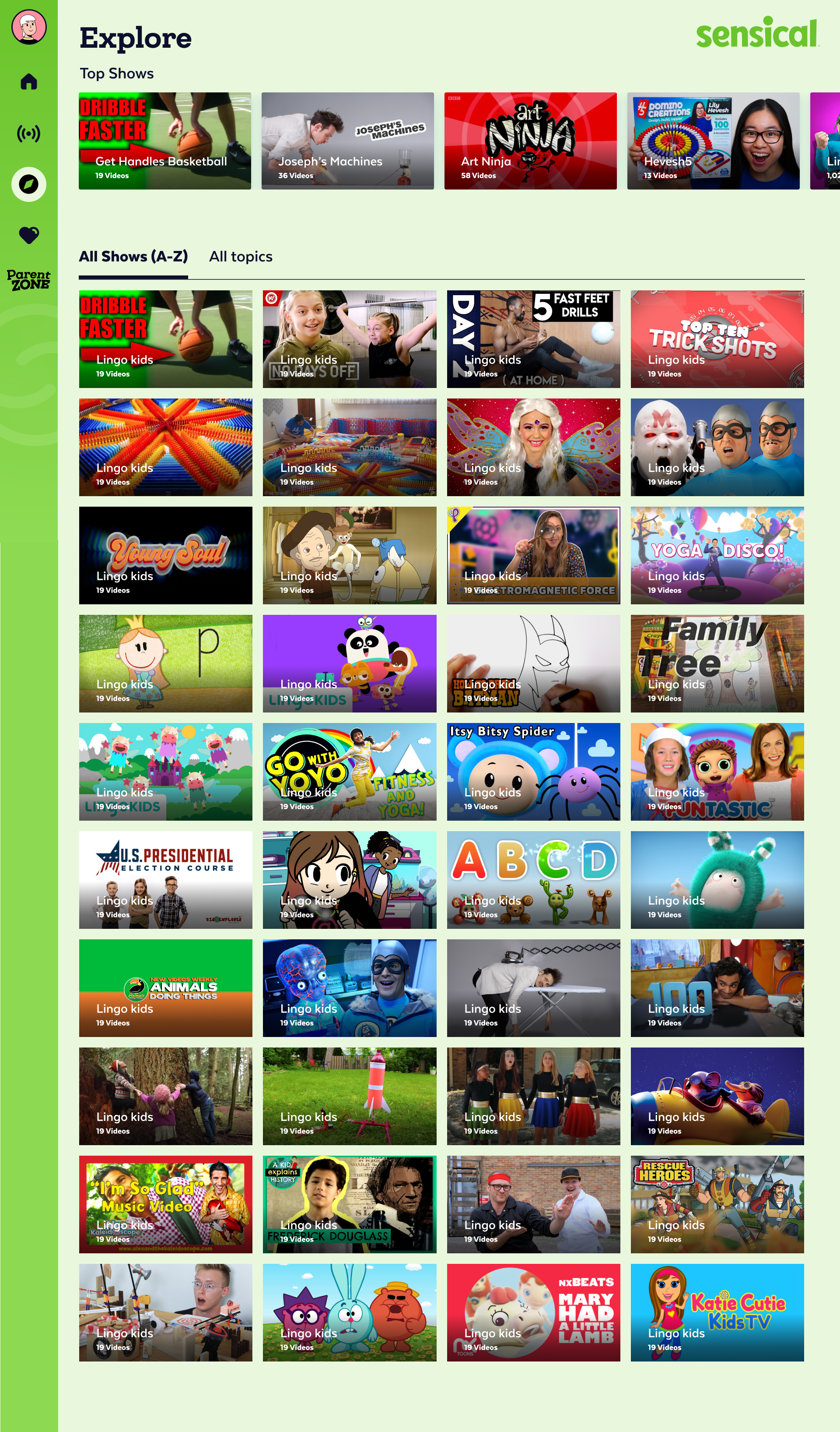
Sensical wasn't a single-platform product. It needed to live in the living room (Apple TV, Roku, Fire TV), in kids' hands (iOS), and in front of parents managing it all (web). Each surface had different interaction models, different primary users, and different design constraints. The through-line was a consistent visual language, age-appropriate information density, and parental controls that worked the same way regardless of where they were accessed.
Working alongside child UX specialists and psychologists gave the design process a foundation that most streaming products don't have. The principles that guided every decision weren't borrowed from adult streaming UX — they came from how children actually develop, process information, and interact with media.
Every other platform's parental controls were built around the same model: block content before it reaches the child. Set age limits. Restrict categories. Lock the app with a PIN. These controls work at the front door — but they don't help with what's already inside.
The insight that came directly from working with child psychologists: the most stressful moment in a parent's relationship with media isn't preventing access — it's taking something away after a child is already attached to it. "You can't watch that show anymore" is a confrontation. It creates conflict, tears, and negotiation. Most parents avoid it and let the content slide.
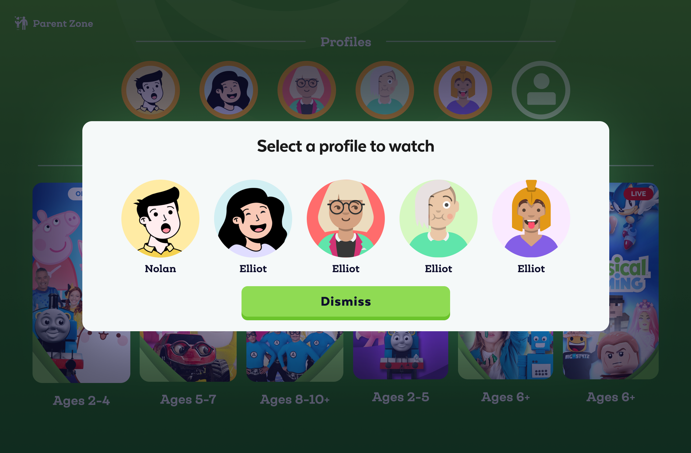
Quiet suppression was designed around this reality. Parents receive a feed of what their child has been watching — not as surveillance, but as awareness. If something appears that they don't want their child to see again, they can silently remove it from the child's experience — no announcement, no confrontation, no argument. The content simply disappears from the child's view, replaced naturally by other content, without the child ever knowing it was removed.
This wasn't a technical feature. It was a behavioral design insight — one that no other streaming platform was talking about, and one that came directly from grounding the design process in child development research rather than engagement metrics.
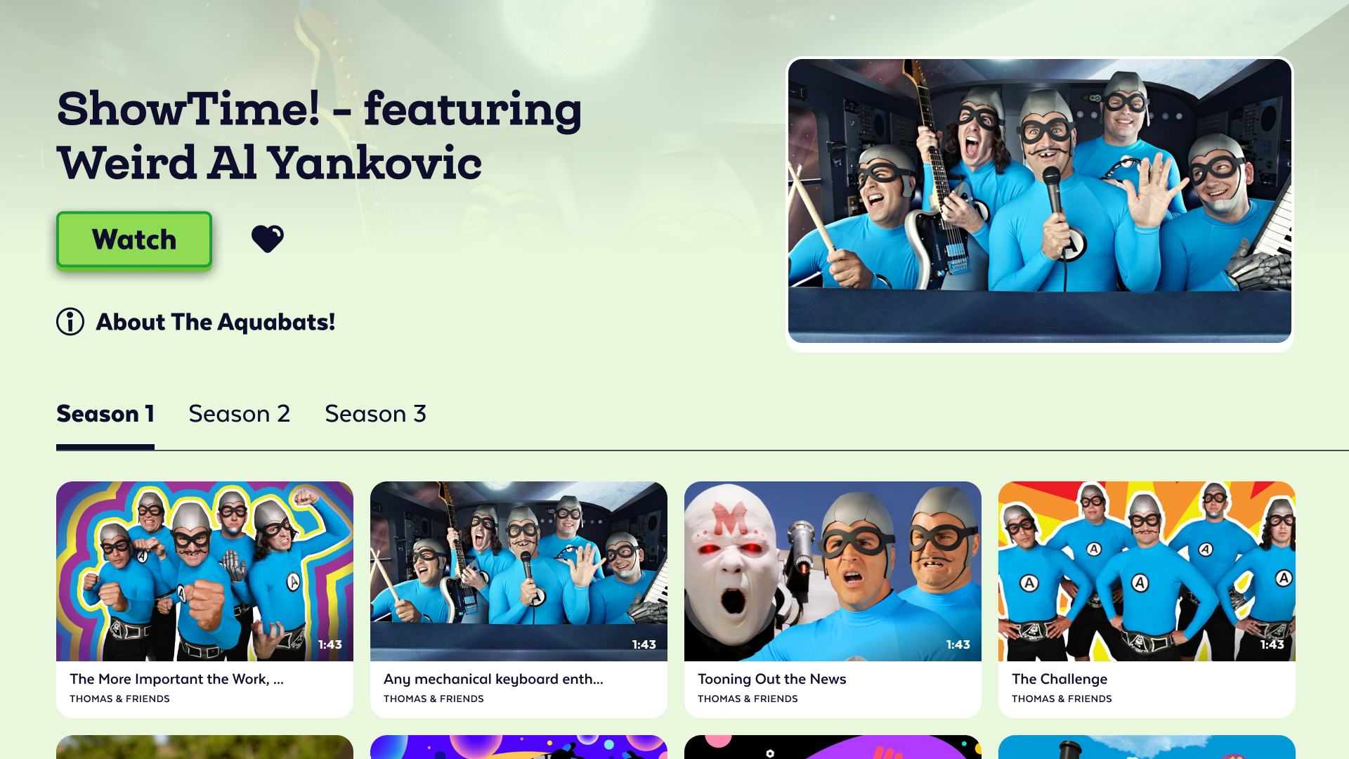
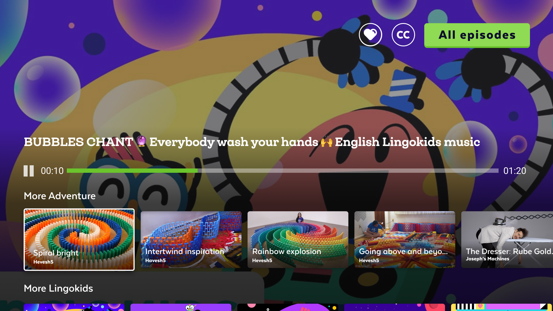
The 10-foot TV experience was the primary consumption surface for most families — the living room, after school, on weekends. Designing for TV required rethinking every interaction assumption from mobile or web: remote control navigation, large visual targets, minimal text, and an interface that a 5-year-old could navigate independently once content was loaded.
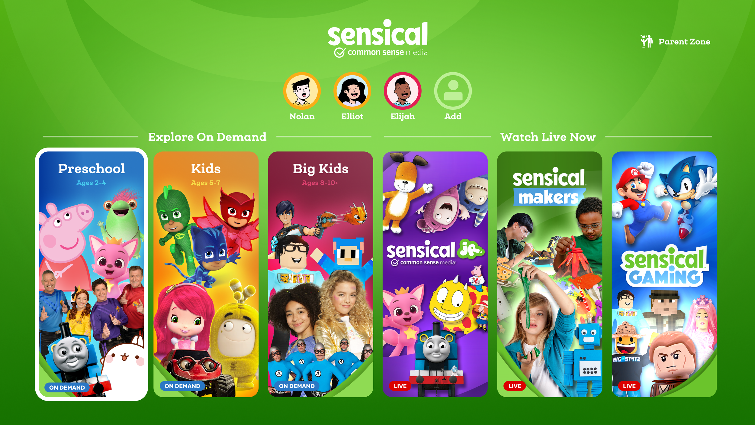
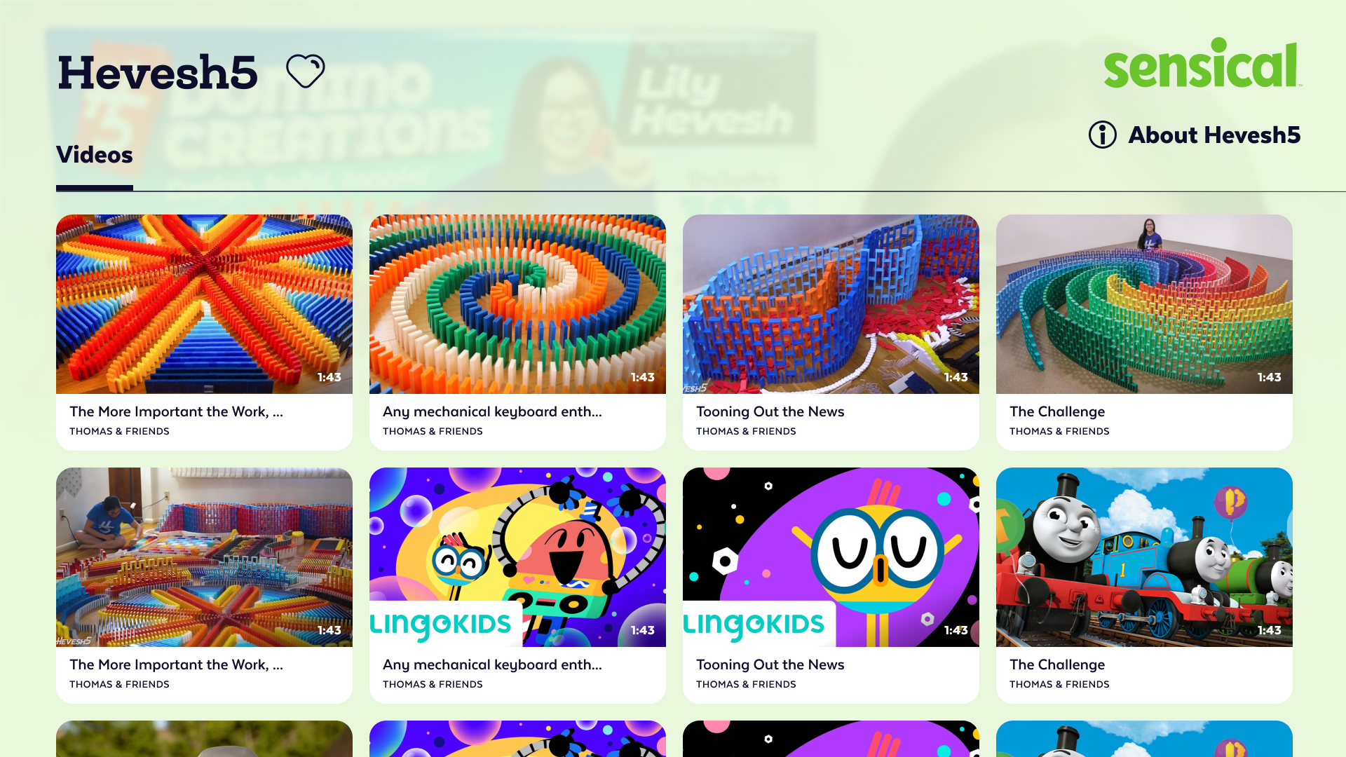
The multi-age profile selector was one of the most considered design pieces in the product. Families with multiple children of different ages needed to switch profiles quickly, with visuals that children could self-identify with — cartoon avatars for younger kids, more mature characters for older ones — without requiring reading ability to make the selection.
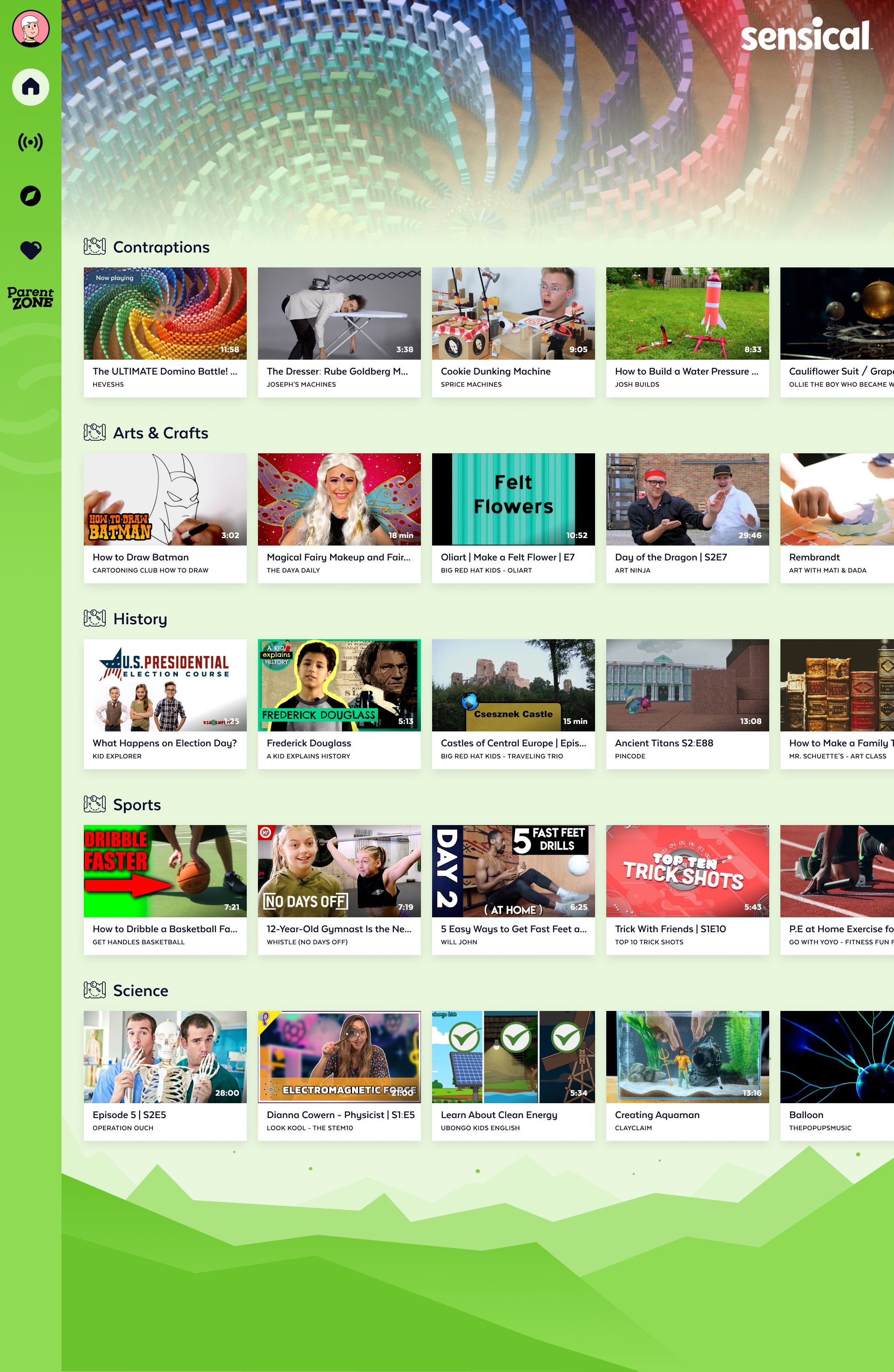
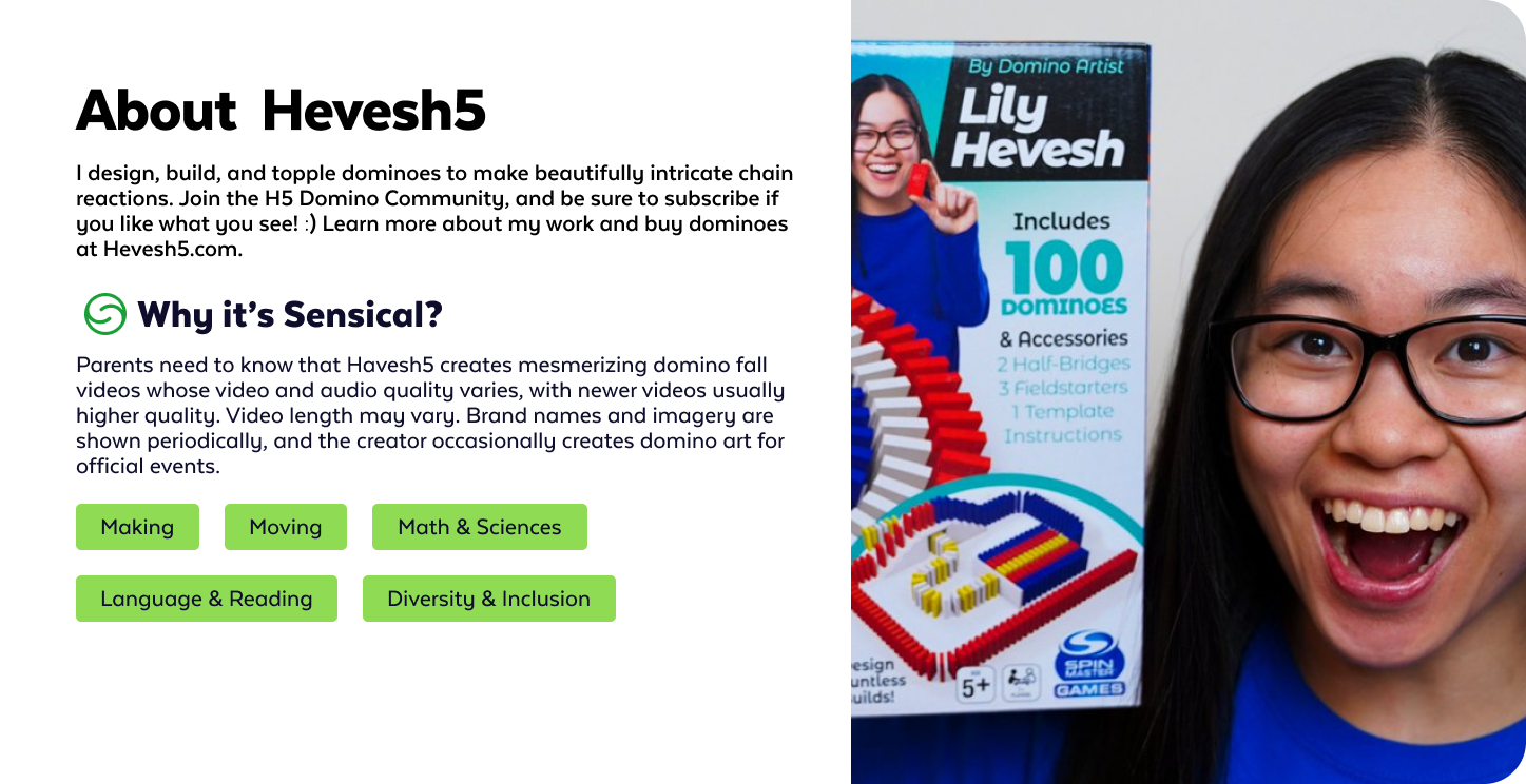
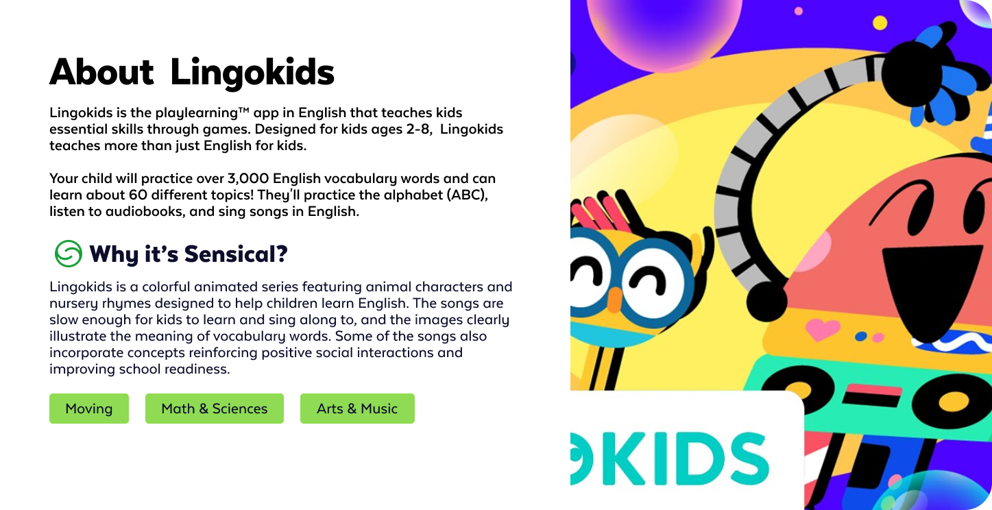
The show detail page was designed to serve two audiences simultaneously: the child who wanted to know if the show looked fun, and the parent who wanted to know if it was appropriate and educational. The tabbed structure separated content for each — the child saw the show, trailer, and episodes; the parent could access the full Common Sense Media rating context, educational themes, and age-appropriateness breakdown.
The meta modal — surfaced when a parent tapped into a show's rating details — brought the full CSM review into the product experience, removing the need to leave the app to check ratings on a separate site.

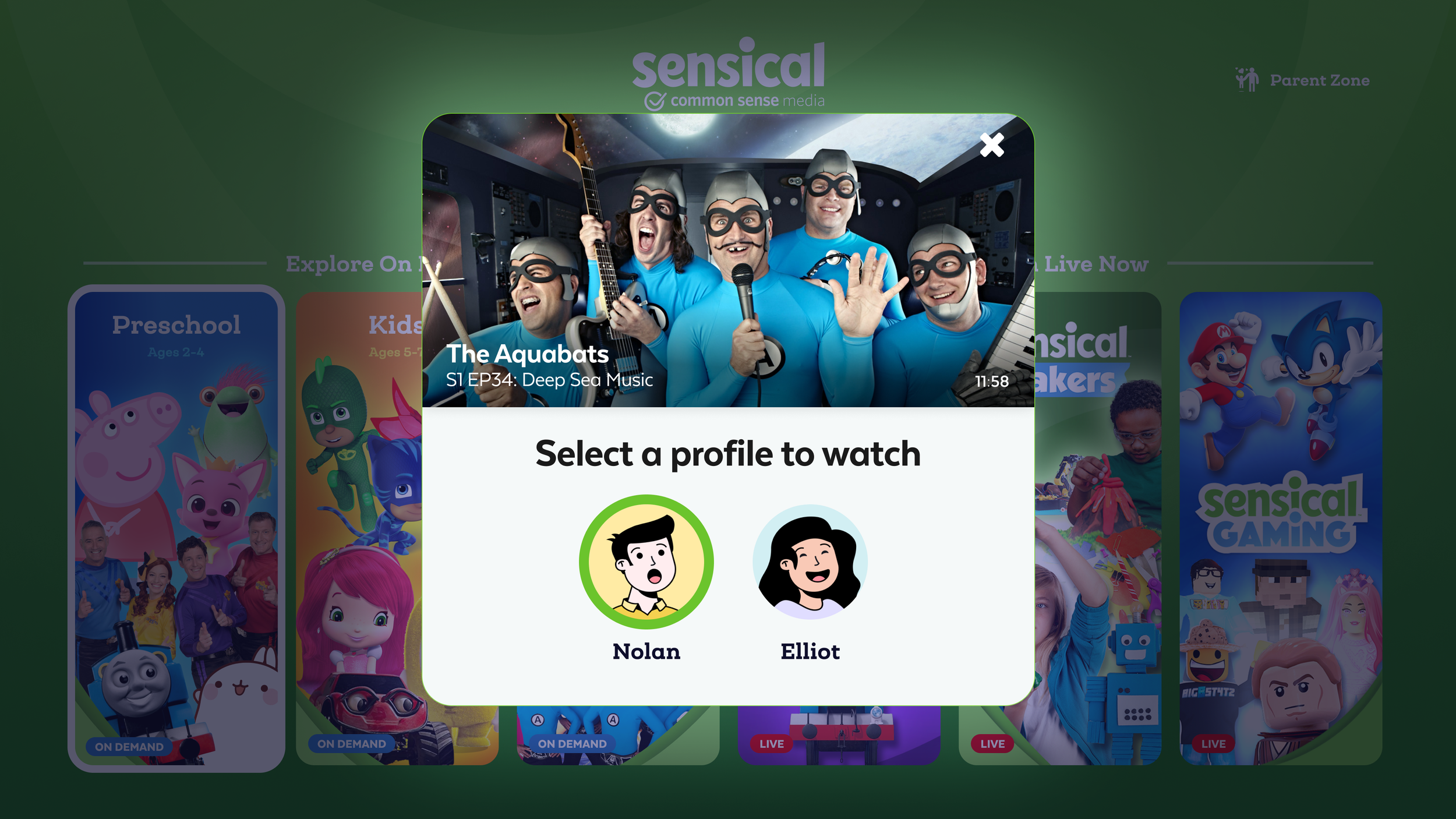
The video playback experience was deliberately minimal for child users — large play/pause controls, no distracting overlays, and no autoplay countdowns that encouraged endless viewing. The controls faded quickly to let the content take over. For parents, the same screen surfaced quiet control access without interrupting the child's session.
The tablet experience bridged the gap between the TV's lean-back living room context and the mobile device's held-in-hand portability. Landscape orientation was the primary mode — matching how children naturally hold tablets for media consumption. The profile selector carried across surfaces, maintaining the same avatar-driven identity system that worked on TV.
One of the distinguishing aspects of this engagement was the direct collaboration with child development professionals embedded in the process. This wasn't user research as an afterthought — it was a foundational input that shaped which features got built and how.
In a single six-month engagement, leading a team of 4 designers, Sensical shipped across web, iOS, Apple TV, Roku, and Amazon Fire TV with a consistent design language, a child-first experience grounded in developmental research, and a parental controls system that introduced a behavioral insight — quiet content suppression — that no other streaming platform had built.