
Four years building the design function at a pre-Series A enterprise telemedicine company — from a six-person team with outsourced design to a HIPAA-compliant design practice serving Kaiser Permanente, Aetna, and 12 large-scale healthcare customers, with 46% faster clinical encounters and $25M in funding contributed to.
The healthcare system has done a remarkable job of making itself inaccessible. Scheduling delays, copays, specialist referrals, and the friction of in-person visits mean that most people avoid care until problems escalate. CirrusMD's insight was simple and radical: 80% of acute care needs can be addressed via text, by a real physician, in the time it takes to send a message.
When I joined pre-Series A, the design was entirely outsourced. Innovation was throttled by hourly agency costs. The six-person product team — one designer, one PM, one iOS developer, one Android developer, two web engineers — was moving fast without a design system, without a research practice, and without the infrastructure to scale.
Build the design function from the inside out. Create a system that could support white-label deployments for enterprise health plans like Kaiser Permanente and Aetna. Design the Advanced Provider Support tools that would make physician encounters 46% faster. And do it all within the constraints of HIPAA compliance, ADA accessibility, and the highest-stakes user context in any industry — someone's health.
Before any new features, the most urgent work was foundational. Design work was passing between a single designer and engineering teams across three platforms — iOS, Android, and web — without shared components, without a documented design language, and without a handoff process that preserved context. Features built in design were arriving in engineering weeks or months later, stripped of the decisions and rationale that made them work.
The design documentation practice deserves particular attention. In most products, a designer hands off work and it ships within days. In healthcare, features could sit in engineering queues for months. Decisions made in a design sprint would be reinterpreted by the time engineering picked them up — the original rationale lost in a game of telephone across departments and stakeholders. Documentation became the institution's memory.
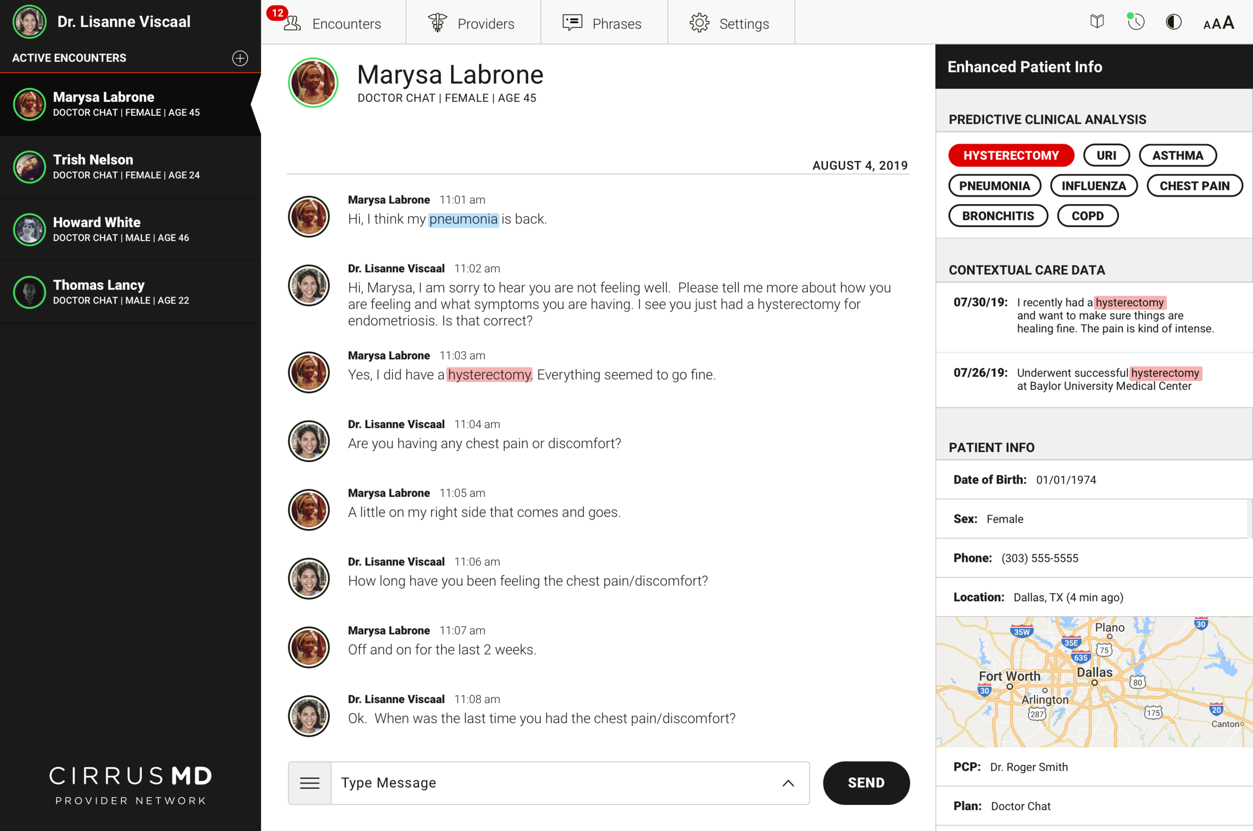
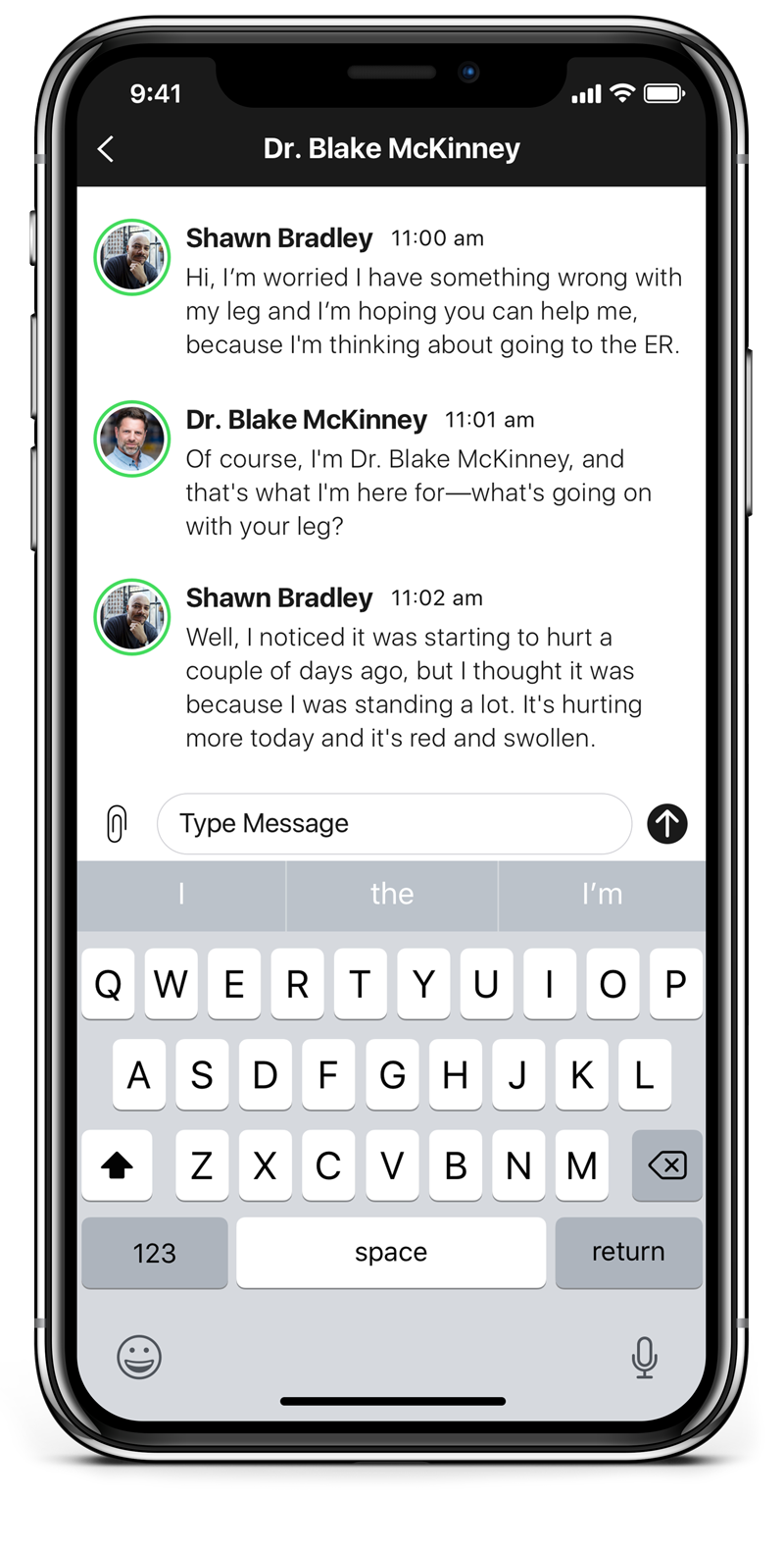
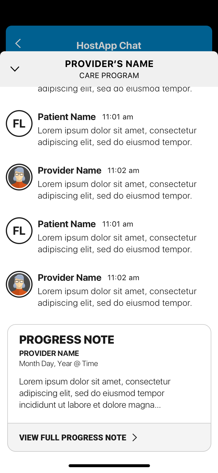
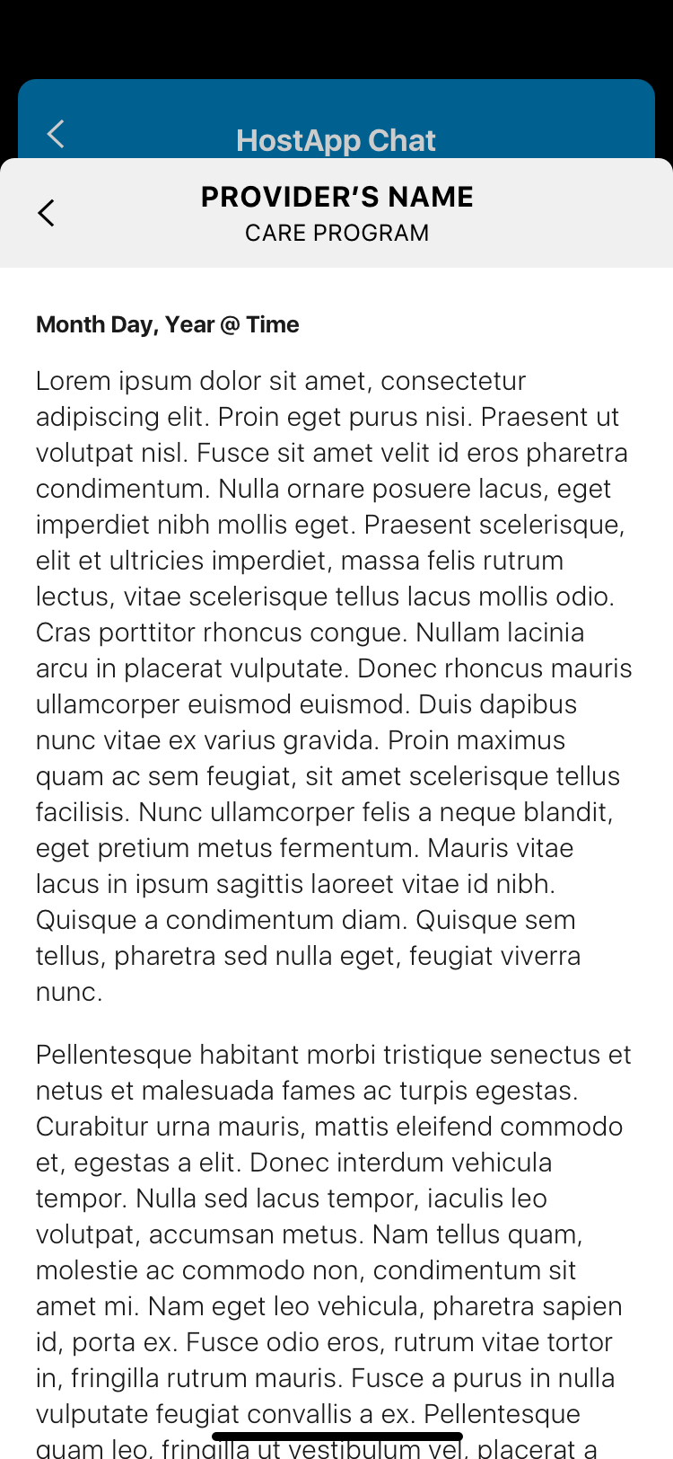
The core clinical insight driving Advanced Provider Support: physicians spend a significant portion of every encounter asking questions they shouldn't need to ask. Medical history, recent procedures, past diagnoses — information that already exists in the patient's record but isn't surfaced at the point of care. Every redundant question is time the physician isn't spending on the problem at hand.
Advanced Provider Support used prediction to surface relevant patient context at exactly the right moment in an encounter. When a patient's first message contained a keyword — "pneumonia," "chest pain," "hysterectomy" — the system cross-referenced their history and surfaced the most relevant prior context for the physician before they even asked a follow-up question.
Armed with relevant contextual data upfront, physicians could get to a faster clinical decision with 46% less back-and-forth Q&A. Faster encounters meant more patients served per physician, lower cost per visit, and — most importantly — patients getting answers in less time when they needed care most.
The design challenge was surfacing this intelligence without disrupting the clinical flow. Physicians are operating under time pressure, managing multiple concurrent encounters, making judgment calls that affect patient outcomes. The AI support had to be additive — enhancing existing clinical judgment, not replacing it or adding cognitive load.
White labeling for enterprise health plans like Kaiser Permanente sounds straightforward until you try to do it correctly. Each customer brings their own brand colors — often complementary schemes, strong hues, colors that weren't designed with UI contrast ratios in mind. Applying those colors naively to CirrusMD's interface produced results that were, at best, aesthetically inconsistent and, at worst, inaccessible.
The deeper problem was structural: our existing three-color analogous system (light blue, medium blue, dark blue) didn't provide the flexibility to accommodate arbitrary customer palettes. We needed a system that could accept any primary brand color and reliably produce a compliant, on-brand interface.
The solution was to stop thinking about colors as static values and start thinking about them as mathematical relationships. We built Color Math — a system that takes a customer's primary brand color and dynamically generates a dark version and a light version using HSL manipulation in code.
The math adjusts hue, saturation, and lightness to guarantee that the resulting palette meets WCAG contrast ratio standards. A customer's brand color might be a medium-value teal or a rich burgundy — Color Math would generate the corresponding dark and light variants that made the interface work, without requiring manual color decisions for each new enterprise deployment.
The byproduct: what started as a white-labeling engineering problem became one of the most robust accessibility features in the product. Every enterprise deployment was WCAG-compliant by default, without any additional design work per customer.
The original enterprise deployment process was manual, expensive, and slow. Every new customer — Kaiser, Aetna, and every health plan after — required a 5-person team working 160 hours to deploy a branded, compliant instance of CirrusMD. That's roughly a full month of work per customer, before a single patient could be seen.
Color Math changed the economics entirely. Because brand theming was now mathematical and automated — not manual — design and engineering used it as the foundation for a fully automated deployment pipeline. The system accepted a customer's brand variables at contract signing and generated a fully compliant, white-labeled instance without any manual design or engineering intervention.
The result: what took a 5-person team 160 hours now took a single technical PM 2 hours. The pipeline triggered automatically at contract signing. Customers went live the same day they signed.
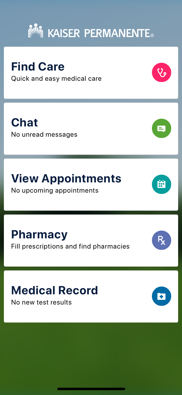
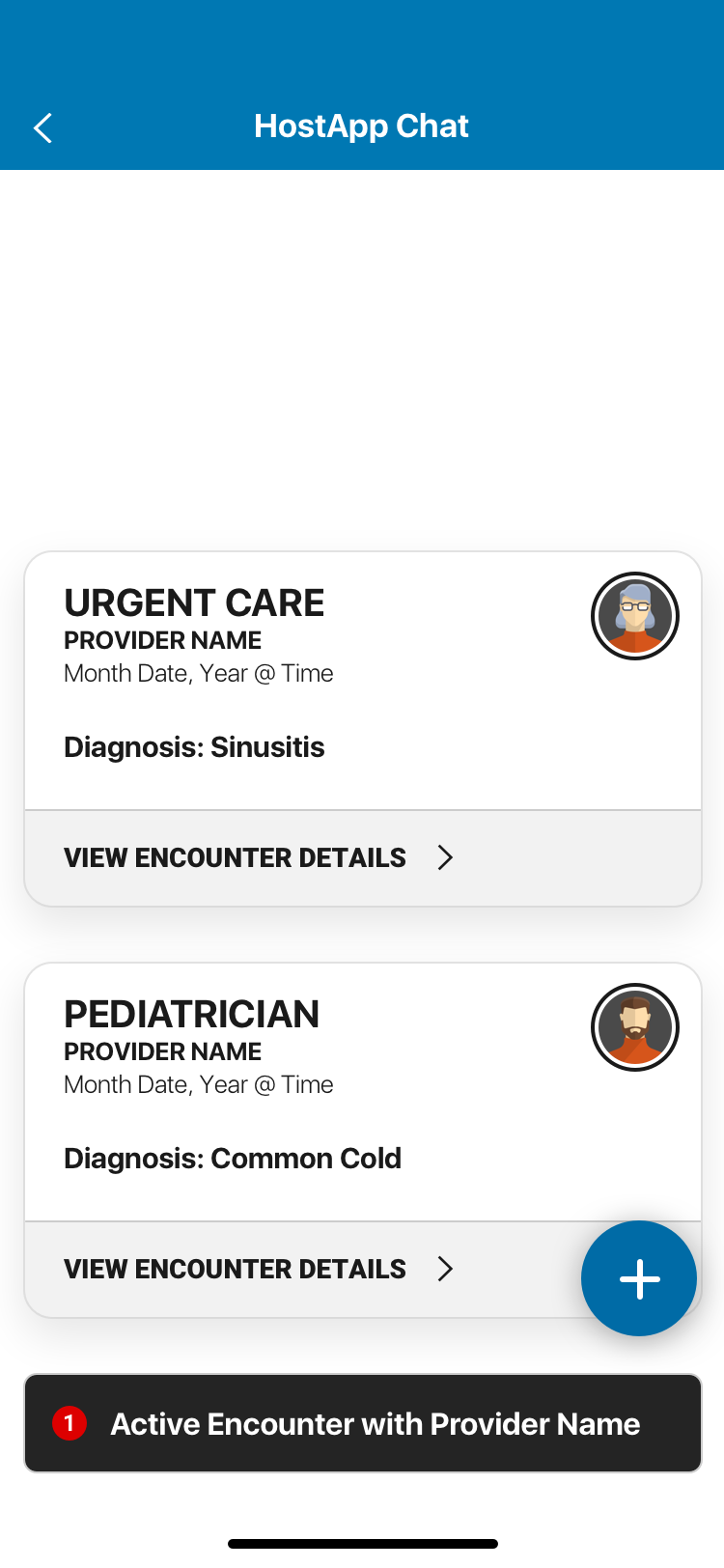
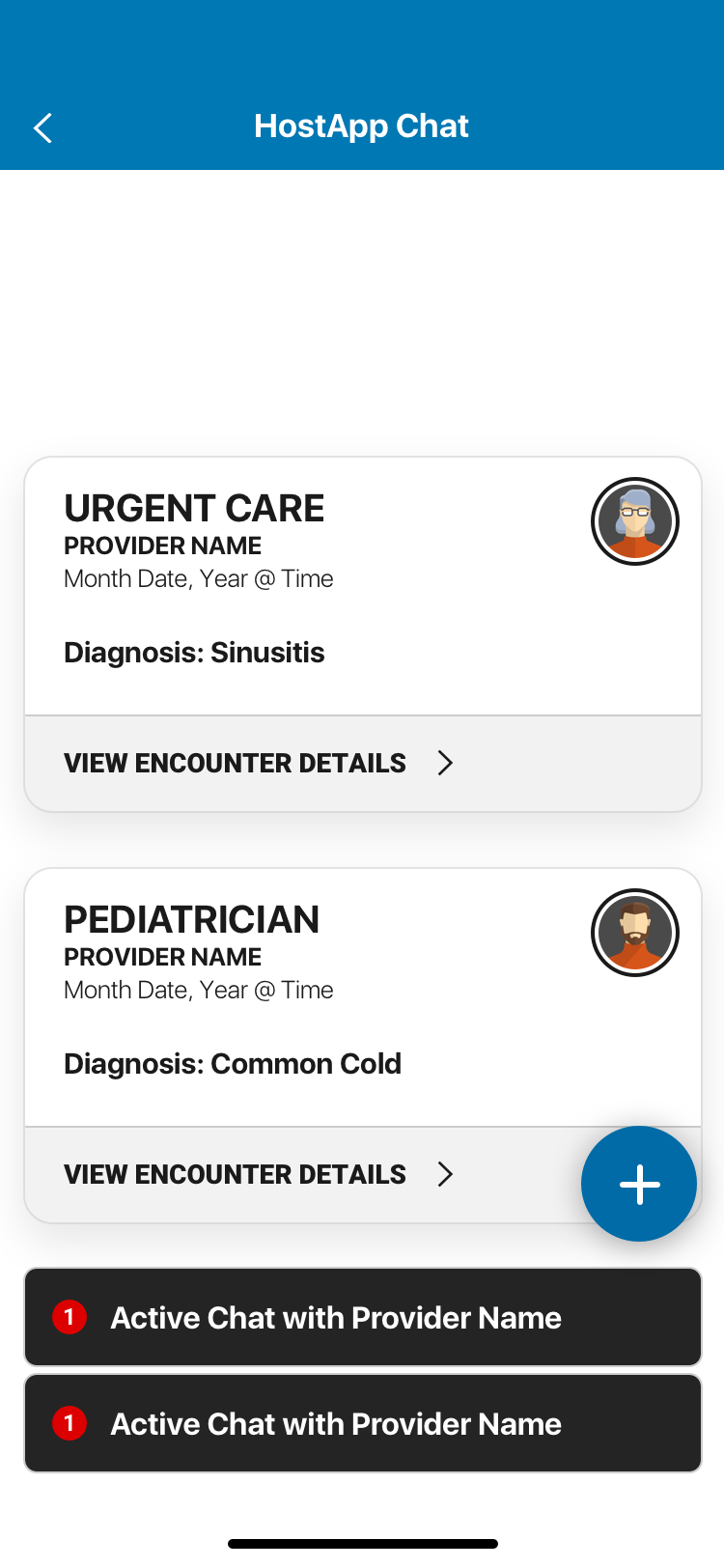
One of CirrusMD's primary distribution channels for enterprise customers was the mobile SDK — an integration that let health plans embed the CirrusMD experience directly inside their flagship apps (Kaiser's app, Aetna's app) without redirecting users to a separate product. The challenge: when you're embedded in another app, that app's navigation controls your navigation. You inherit their UX decisions, their chrome, their interaction patterns.
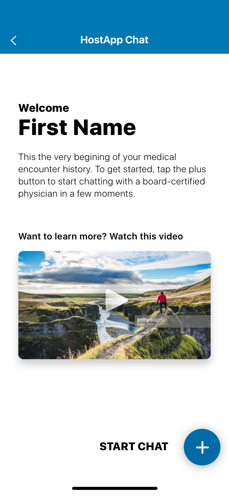
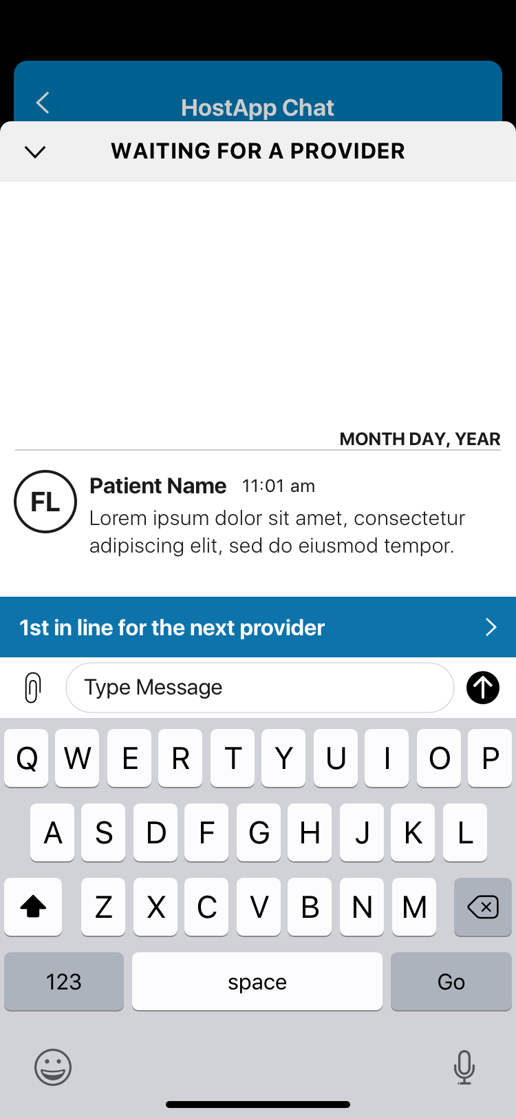
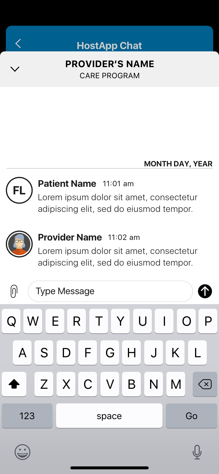
The SDK redesign solved this by building a navigation layer that sat on top of the host app — removing the dependency on the host's navigation entirely. A single entry point, a single exit point, and full UX control within that container. The Encounter Stream — a persistent view of past and ongoing medical chat encounters — became the SDK's home base, with iOS modal interactions for individual encounter details that kept the experience feeling native without sacrificing CirrusMD's clinical UX standards.
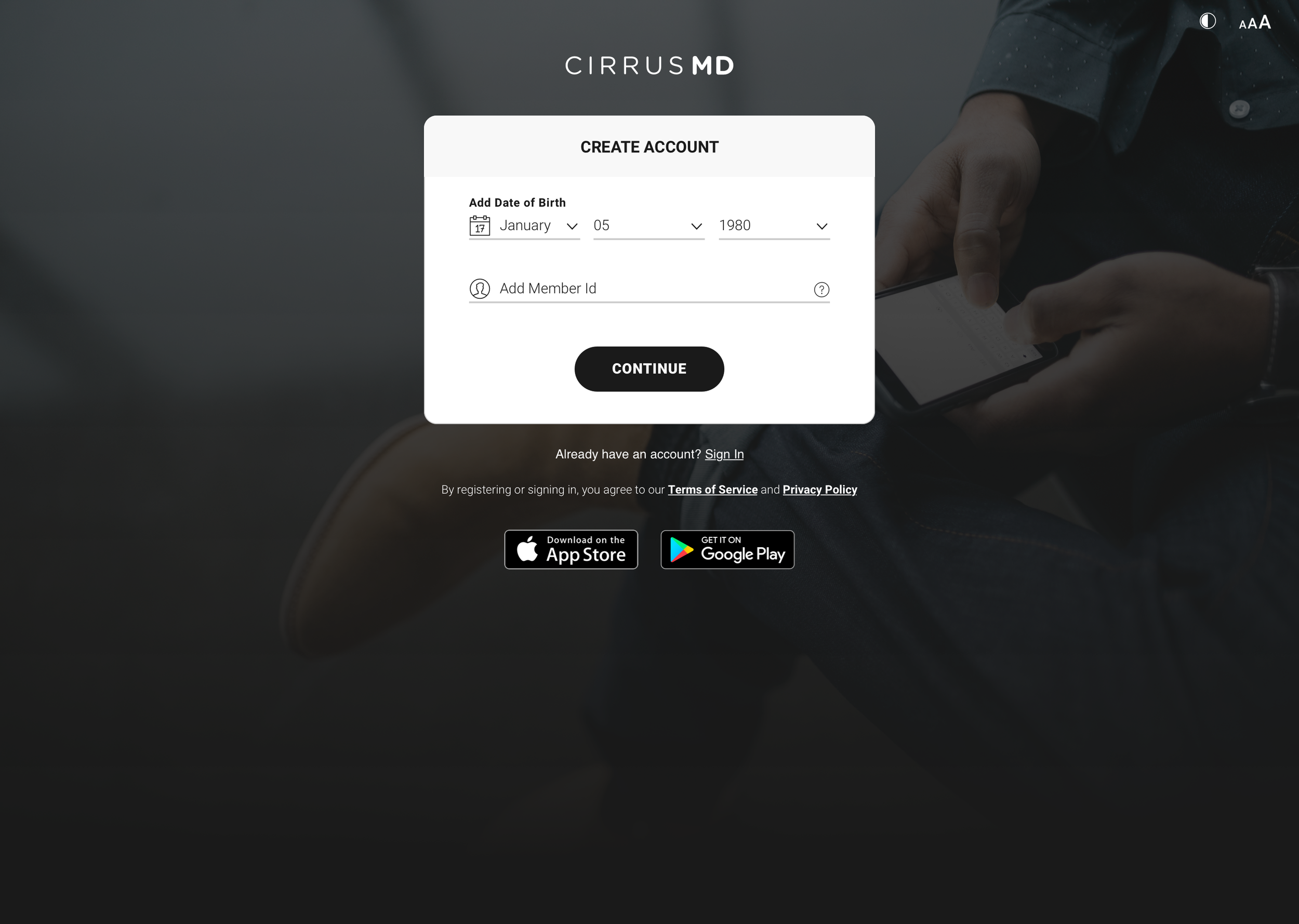
Color inheritance was handled through Color Math, so the SDK automatically adopted the host app's brand identity on load — visually seamless from the patient's perspective.
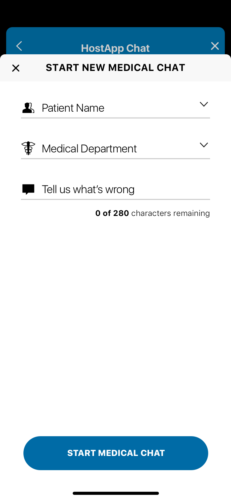
Patient registration in healthcare typically feels like healthcare: long forms, insurance verification, confusing fields. CirrusMD's registration was designed around the reality of when and why someone was registering — they were likely already experiencing a health concern. Every unnecessary field was a barrier to care.
CirrusMD was where I learned what it means to design for the highest-stakes user context — where the person on the other end of your interface is worried about their health or their child's health, and the physician on the other end has seconds to make the right call. Every design decision carried real weight. The work demanded rigor, compliance expertise, and genuine empathy in equal measure.